by Bank of Cyprus
The first Digital Economy Platform in Cyprus
My Role: UX/UI Designer
Team: two UX/UI Designers and Head of Creative
Tasks I Tackled: Competitive Research, Wireframing, Prototyping, Interaction Design & Visual Design
Platform: Mobile
Tools: Adobe XD
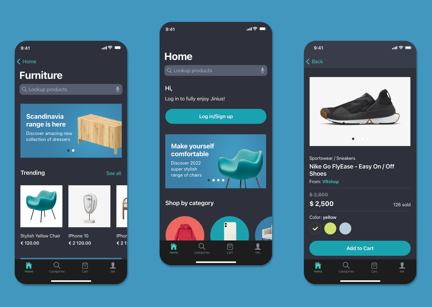
Overview
Dark-mode has become increasingly popular over the last few years. Starting with iOS and Android 10, new software versions are being released with support for automatic dark theme switching for a great viewing experience in low-light environments. Having approved the designs for the light-mode version of the Jinius application, Bank of Cyprus has asked our team to create a dark mode for the iOS Jinius application. Dark mode is now so ubiquitous that it was important to allow users to switch between light and dark modes to accomodate those who wanted to use the Jinius app in low-light conditions, reduce battery usage and blue light exposure or simply prefer the dark color palette.
Challenge
Paying close attention to the original color palette we have used while designing the iOS light-mode Jinius application, we set to design a matching darker palette that would be in alignment with the brand identity and colors.
Competitive Analysis
These days, well-known brands highlight the availability of dark themes within their products or systems, making it an important, if not indispensable, asset in terms of user experience. Curious to see how other e-commerce companies have approached creating dark-mode versions of their apps, our team has analyzed some of Jinius' potential global competitors, such as Amazon, ASOS, Zalando etc. We quickly discovered that there was no uniform approach to creating the dark mode - some brands opted for a stark contrast, choosing pure black background and white text, while others went for more toned-down shades of gray avoiding strongly contrasting colors yet still observing the minimal contrast ratio required by best practices of accessibility standards in design.

Style Guide and Color Palette
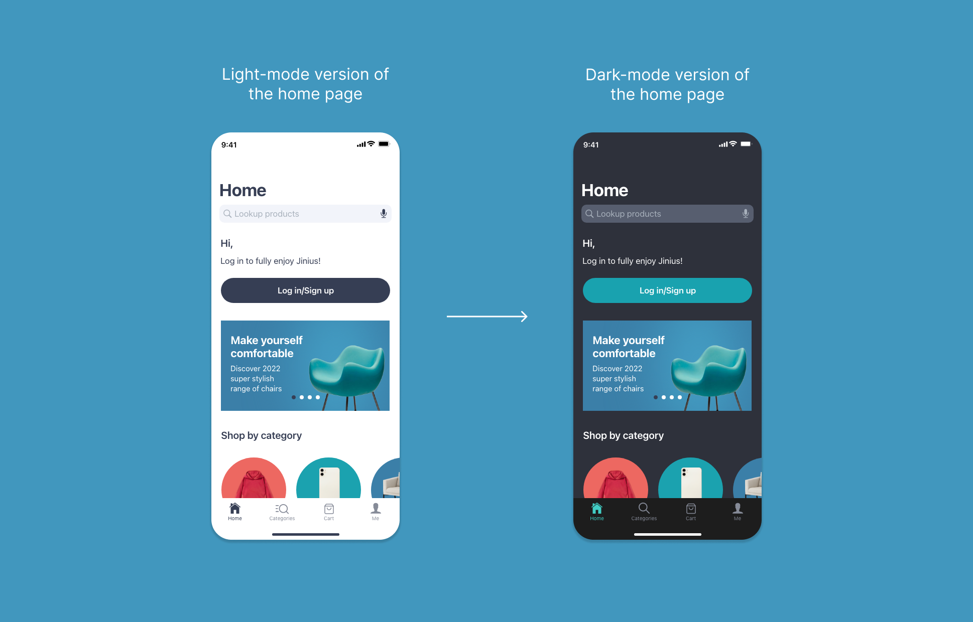
Since we wanted to avoid using strong contrast, we decided against using black and white colors for background and text, respectively. Instead, our team started experimenting with creating a dark palette by trying out darker shades of some of our brand colors, already present in the light-mode version of the Jinius application. We have started with the homepage screen and then continued with some of the screens with markedly different components.
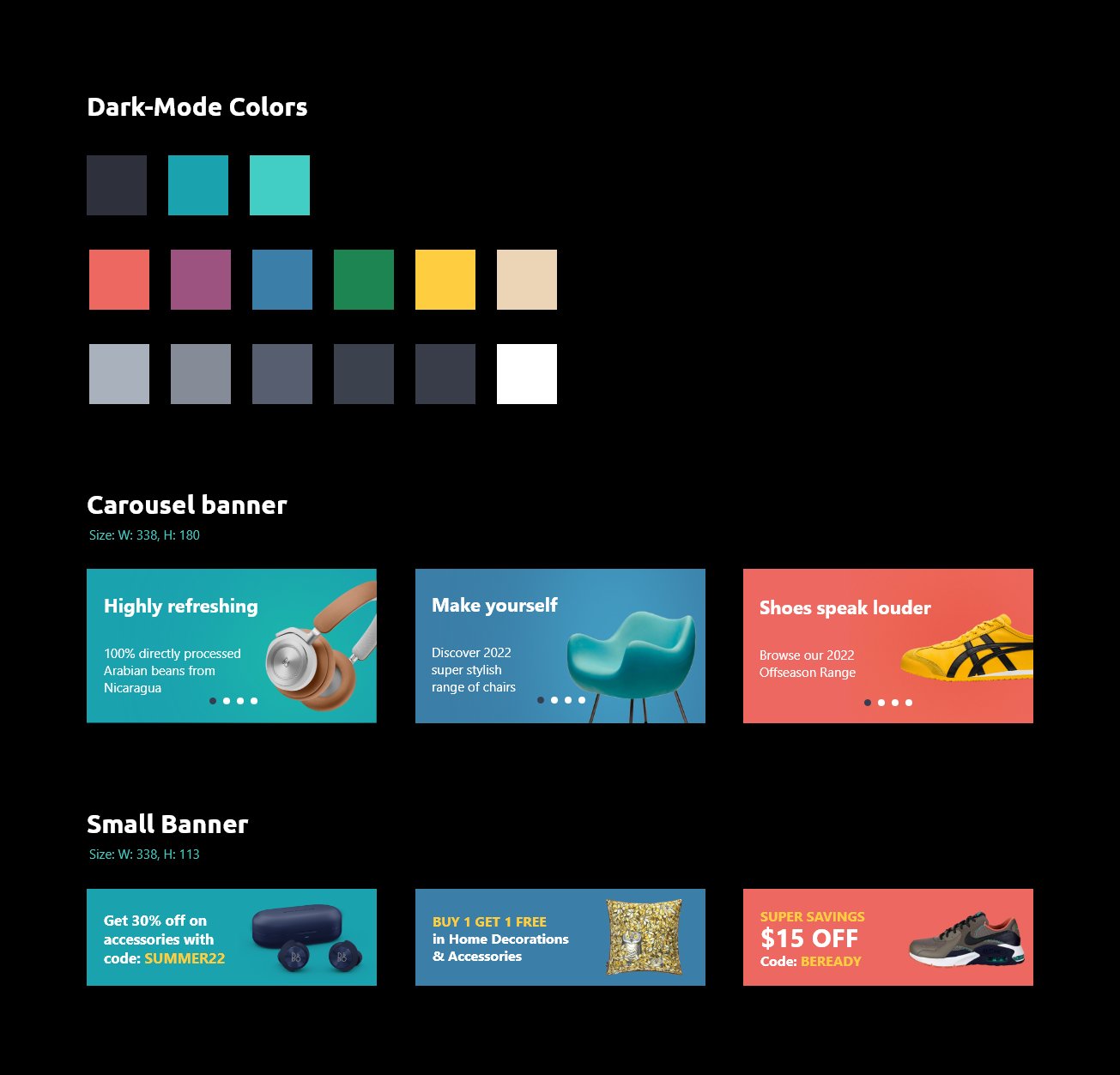
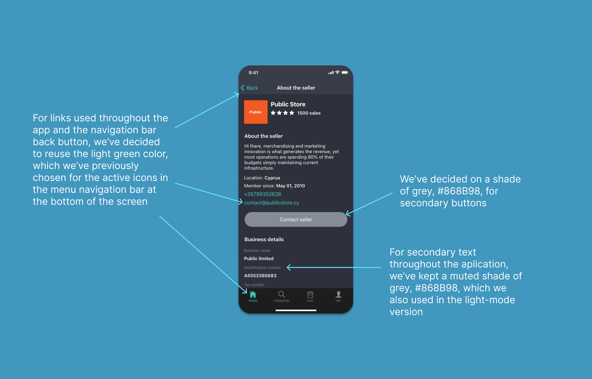
Many guides, including the Material Design guide for iOS, recommend selecting a neutral dark gray (#121212) as the base for the background color. Unlike black, it leaves space for creating screen depth. Having tried out a few different shades of grey for the background, we've decided on a darker shade of our dark blue color, #363E54, which was used for text and primary buttons throughout the light-mode Jinius app.
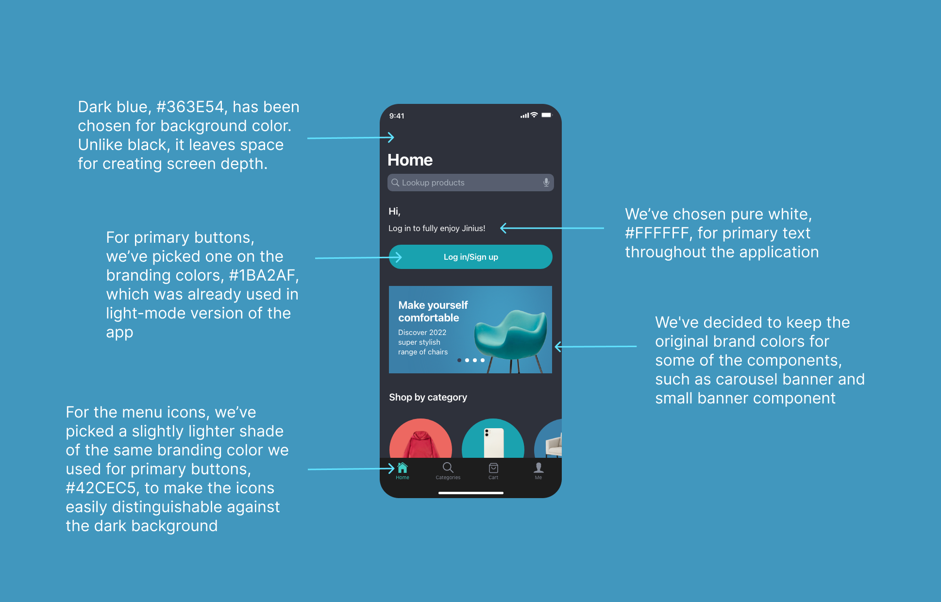
For the primary text, we have chosen pure white #FFFFFF and for primary buttons we have picked one of the original branding colors, #1BA2AF, also used for CTAs and carousel components in the light-mode version of the application. With accessibility in mind, we have created a lighter shade of that color for the menu icons on the navigation bar at the bottom of the screen to ensure the proper contrast ratio between icons and the backround of the navigation menu.
Prototyping
Having decided on the colors we intended to use or the dark-mode version, we've implemented them in the prototypes and tested the content to make sure that it remained comfortably legible in both appearance modes.
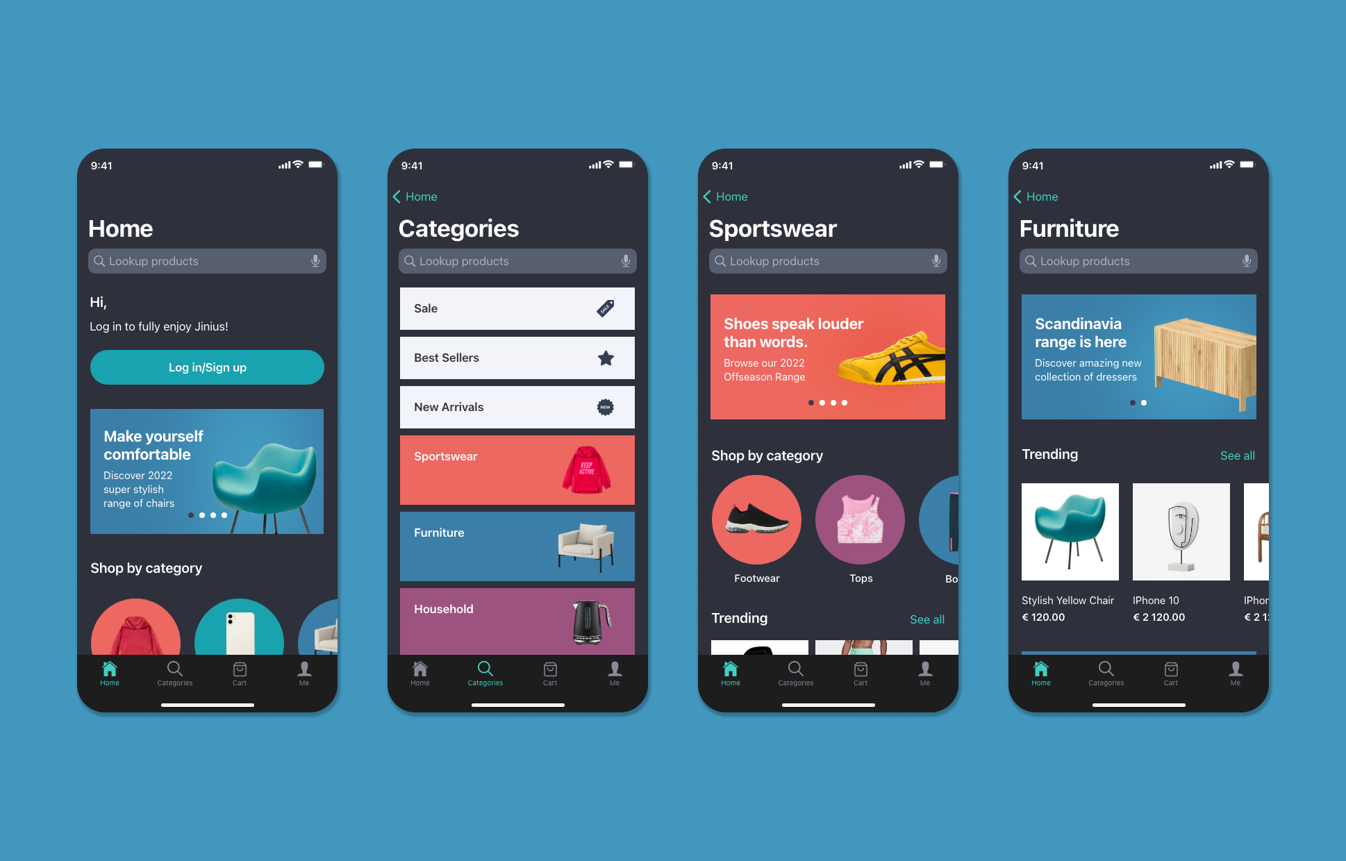
Landing page and categories
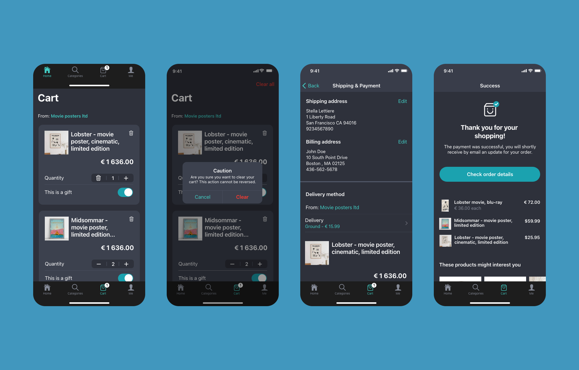
Cart
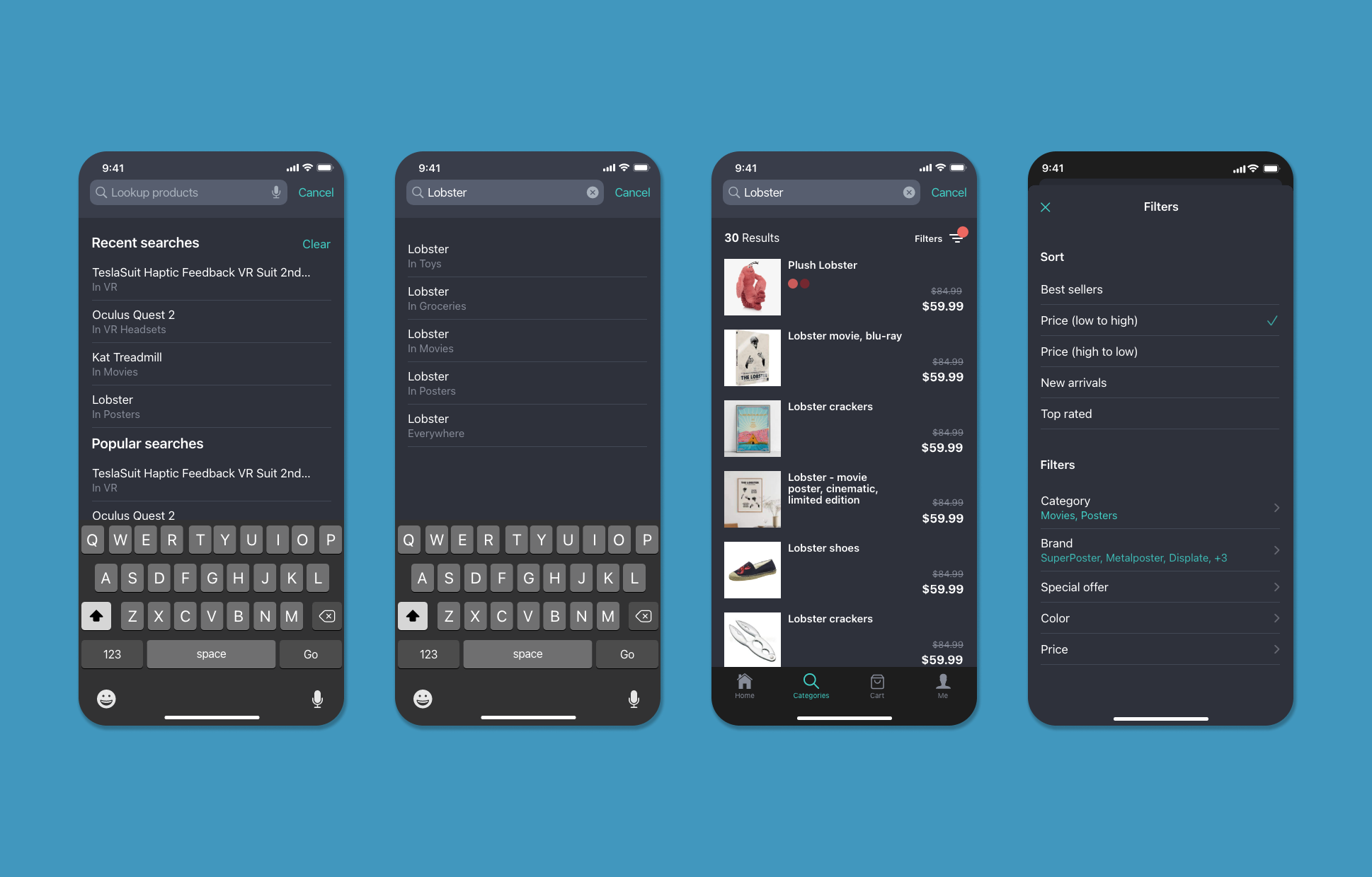
Product search
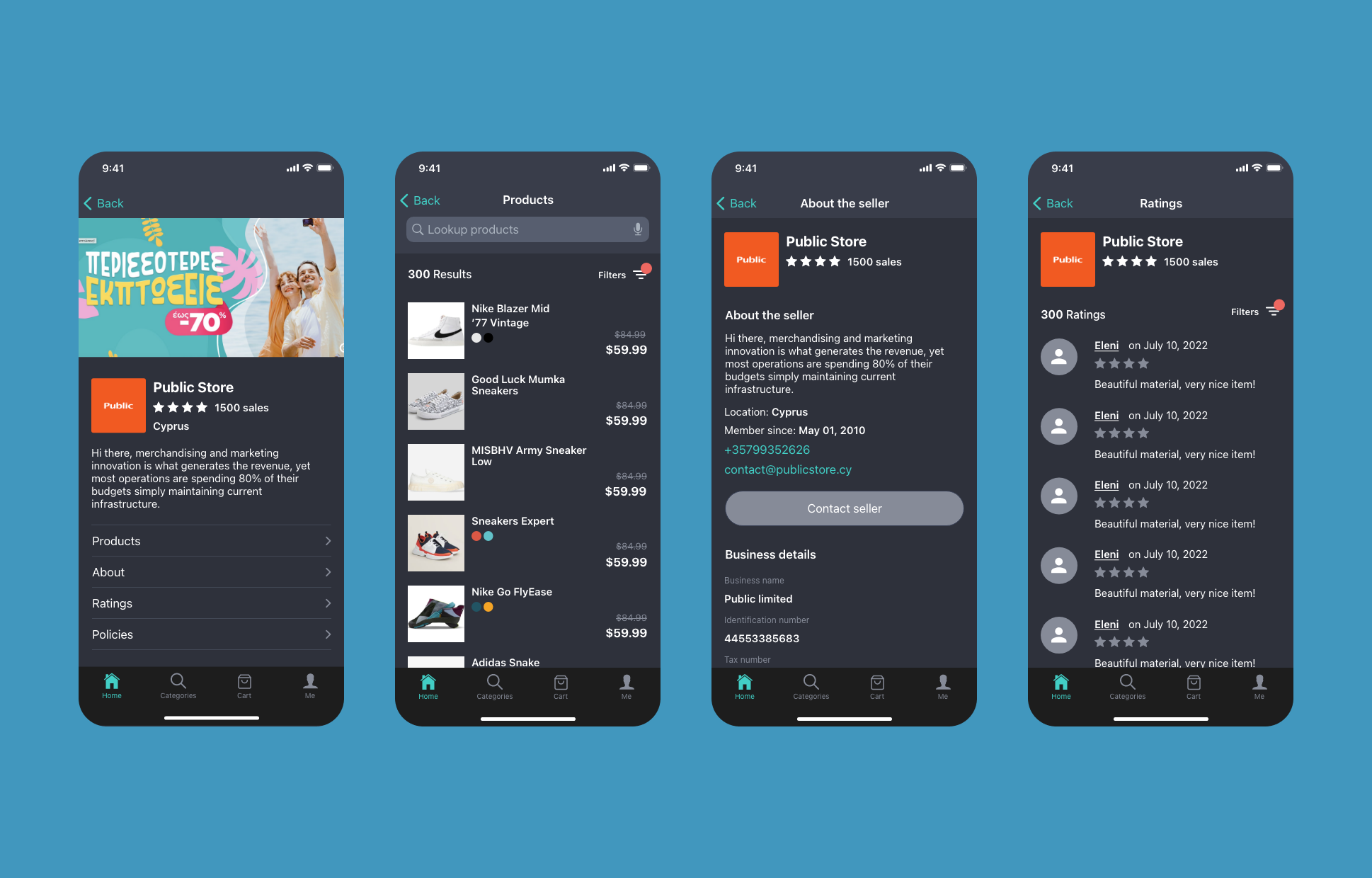
Seller pages
Key Takeaways
Thanks for reading!